Stop Prompting for Diagrams: Two Skills That Actually Work
I wrote about HTML being unreasonably effective as AI output last month. The thesis was simple: AI agents produce dramatically better visual artifacts when they write HTML instead of binary formats. They can see what they’re generating, iterate on it, and the output is shareable by default.
What I didn’t solve in that post was the taste problem. Sure, Claude Code generates good HTML. But “good” depends entirely on how much context you front-load into the prompt. Want a polished architecture diagram? You’re writing a 200-word prompt describing layout rules, color palettes, SVG conventions, and spacing constraints. Every single time. For every single diagram.
Two projects just solved this in the most obvious way possible: installable skills with bundled reference examples.
The Mermaid and Draw.io Ceiling
The default answer to “I need an AI-generated diagram” has been Mermaid for the past two years. Ask any LLM for an architecture diagram and you’ll get a Mermaid code block. It’s fine for simple flowcharts. But anyone who’s tried to make a complex architecture diagram in Mermaid knows the pain: limited layout control, no custom styling beyond basic themes, text overflow on longer labels, and an auto-layout engine that makes bizarre decisions the moment you exceed 8-10 nodes.
Draw.io (now diagrams.net) is the other popular option. Better layout control, but it’s an XML format. LLMs can technically generate .drawio XML, but the output is fragile. One malformed attribute and the file won’t open. And even when it works, you’re locked into Draw.io’s renderer. No custom fonts. No responsive layouts. No inline SVG effects. No interactivity.
| Approach | Layout Control | Visual Quality | Shareability | AI Reliability |
|---|---|---|---|---|
| Mermaid | Auto-layout only | Theme-limited | Embed or screenshot | High (text output) |
| Draw.io XML | Manual positioning | Medium | .drawio file or export | Low (XML fragility) |
| HTML + SVG | Full CSS/SVG control | Unlimited | URL or file | High (text output) |
The real trade-off: Mermaid is easier to version-control (compact text diffs). HTML diagrams are harder to diff but dramatically better to look at and share. For documentation that lives in a README and rarely changes, Mermaid still works. For anything you’d put on a slide, share in Slack, or print, HTML wins.
The Prompt Tax
Even once you accept HTML as the right format, there’s a cost. Here’s what a “good” architecture diagram prompt looks like without a skill:
Create a full-screen HTML architecture diagram showing our microservices.
Use SVG for all elements. Dark background with a subtle grid pattern.
Color-code by type: cyan for frontend, emerald for backend, violet for
databases. Use JetBrains Mono. Add gradient backgrounds. Make the arrows
use proper path elements with arrowhead markers. Include a legend. Make
it responsive. Add card-style component boxes with rounded corners and
subtle shadows...
That’s 80+ words of styling instructions before you even describe the architecture. And you’ll write something similar next time. And the time after that. Each prompt is a one-shot gamble. Sometimes the agent interprets “subtle grid” as you intended. Sometimes it doesn’t.
The problem isn’t the model’s capability. It’s the absence of persistent visual taste. Every conversation starts from zero.
Skills Fix the Cold Start
Effective HTML and Archify both solve this the same way: they ship reference examples alongside the skill definition. The agent doesn’t need your 200-word prompt because it has a corpus of “this is what good looks like” baked into its context.
Install either one in a single command:
# Effective HTML (three focused skills)
npx skills add plannotator/effective-html

# Archify (architecture + workflow + sequence + dataflow + lifecycle)
npx skills add tt-a1i/archify
After install, your prompt shrinks to what actually matters:
Draw an architecture diagram: React frontend, Node API, PostgreSQL,
Redis cache, Kafka event bus, deployed on AWS with CloudFront.
No styling instructions. No color guidance. No layout rules. The skill’s reference corpus handles all of that. The agent already knows what “good” looks like because it has examples, not because you described “good” in natural language.
Two Tools, Different Philosophies
Both tools produce self-contained HTML files with SVG diagrams. But they solve slightly different problems.
| Effective HTML | Archify | |
|---|---|---|
| Focus | General-purpose HTML artifacts (diagrams, plans, documents) | Architecture and technical diagrams specifically |
| Diagram types | Architecture, stack, systems | Architecture, workflow, sequence, data flow, lifecycle |
| Styling | SVG-first, minimal prose, full-screen | CSS custom properties, semantic color classes |
| Dark/Light | Single theme, high-quality defaults | Built-in toggle with localStorage persistence |
| Export | Open the HTML file | Copy PNG, download PNG/JPEG/WebP/SVG (4x native resolution) |
| Keyboard shortcuts | None | T (theme), E (export menu) |
| Install | npx skills add plannotator/effective-html | Unzip to ~/.claude/skills/ |
| Skills included | html, html-diagram, html-plan | Single skill covering 5 diagram types |
Effective HTML is the generalist. It gives you three skills covering any kind of HTML artifact: diagrams, plan documents, and freeform HTML pages. The html-diagram skill produces architecture and stack diagrams with SVG-first presentation. Think of it as a general-purpose “make beautiful HTML” toolkit where diagrams are one output type.
Archify is the specialist. It goes deep on technical diagrams specifically. Five typed renderers (architecture, workflow, sequence, data flow, lifecycle), schema validation via ajv, a semantic color palette (cyan for frontend, emerald for backend, violet for databases), and a full export pipeline that produces crisp 4x resolution rasters. The SVG export is dual-theme: drop the same .svg into a GitHub README and it follows the reader’s dark/light preference automatically via @media (prefers-color-scheme).
Why Reference Examples Beat Prompts
The real insight here isn’t “install a tool.” It’s why the skill pattern produces consistently better output than even a well-crafted prompt.
A prompt describes what you want in natural language. Natural language is ambiguous. “Subtle grid background” means different things to different people, and to the same model on different days. You’re relying on the model’s interpretation of your words mapping to the visual output you imagined.
A reference example shows what you want in code. There is no interpretation step. The agent sees the actual SVG grid pattern, the actual CSS color values, the actual spacing between elements. It replicates the pattern, not an interpretation of a description of the pattern.
Prompt approach:
  "Use a subtle grid" → model interprets → variable output

Skill approach:
  reference/grid-example.html → model copies pattern → consistent output
This is the same principle behind few-shot prompting, but applied to visual output. Except instead of cramming examples into your context window every conversation, you install them once and they persist across sessions.
The numbers bear this out. With a raw prompt, I’d typically need 2-3 iterations to get a diagram I was happy with. With either skill installed, the first output is usable 80-90% of the time. That’s the difference between a 5-minute task and a 15-minute task. Multiplied by every diagram you generate.
Effective HTML in Practice
Effective HTML bundles the html-effectiveness example corpus by Thariq Shihipar directly alongside each skill. When you ask for an html-diagram, the agent loads those reference files into context before generating anything.
The skills break down by use case:
# Install just the diagram skill
npx skills add plannotator/effective-html --skill html-diagram

# Or just the plan skill for structured planning documents
npx skills add plannotator/effective-html --skill html-plan

# Or the general-purpose HTML skill
npx skills add plannotator/effective-html --skill html
The diagram output is full-screen, SVG-first, and opinionated about minimal prose. It produces the kind of architecture overview you’d put on a conference slide or a team wiki, not a cluttered diagram with text annotations everywhere.
Here’s what the output looks like in practice (generated by Fable 5):
The skill folder ships examples that smaller models can distill from, which is a smart pattern for making skills work across model tiers. Fable 5 produces the reference artifacts, and Claude Sonnet or Haiku can replicate the patterns from those examples without needing the same spatial reasoning capability from scratch.
Archify in Practice
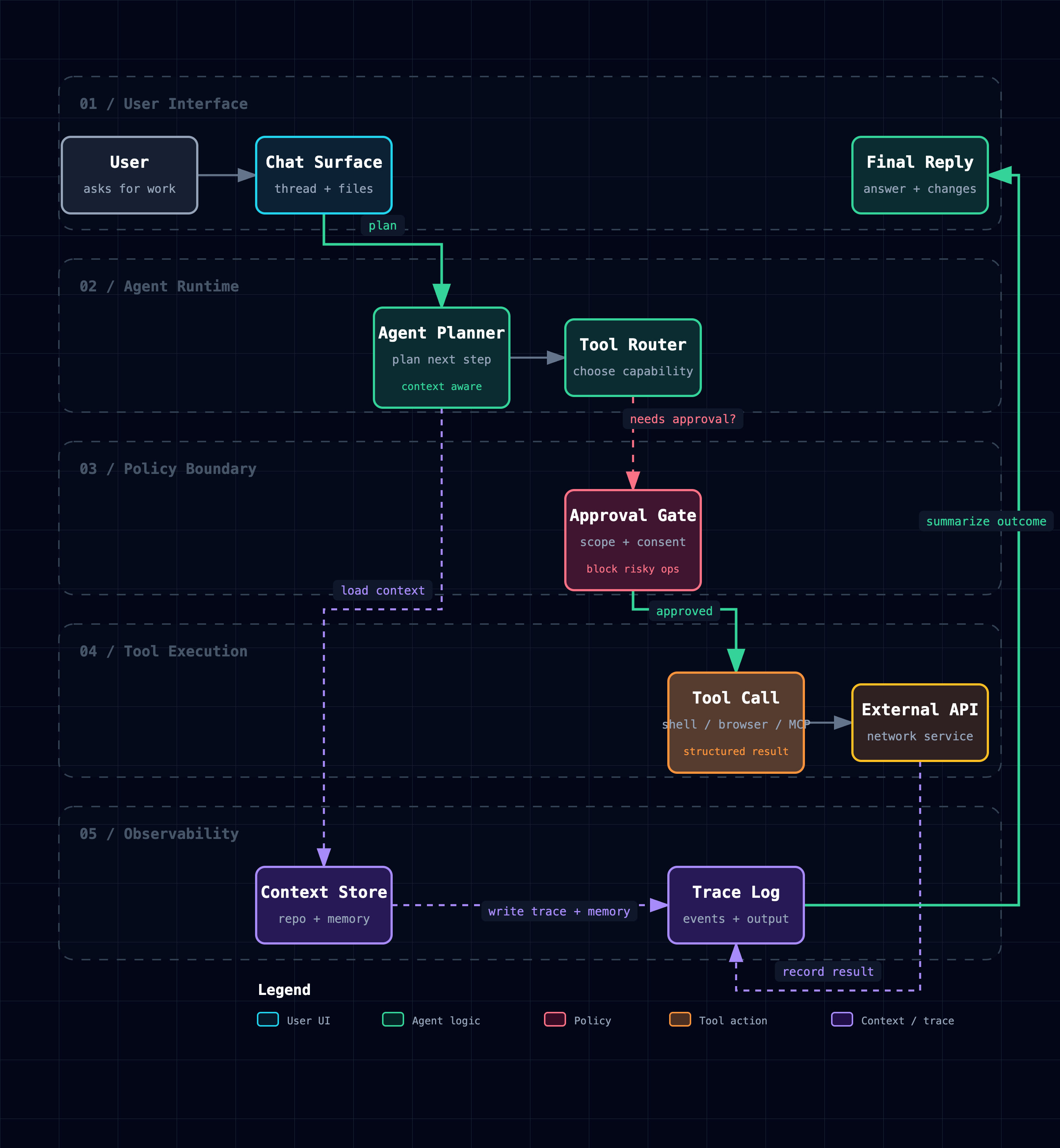
Archify goes further on the diagram-specific tooling. Describe your system in English, get back an HTML file with theme switching, keyboard navigation, and production-quality export.
The five diagram types cover most technical communication needs:
Use archify to draw a sequence diagram:
User opens page, frontend calls API, API verifies JWT, reads Redis,
falls back to Postgres on cache miss, returns JSON, emits trace.
Use archify to draw a lifecycle diagram:
Agent Run starts at Queued, moves through Planning, Executing, Reviewing.
Can pause at Needs Approval, wait at Blocked, retry after Failed,
end at Cancelled/Expired/Completed.Here’s what a workflow diagram looks like out of the box:
Same diagram, two themes, one click:
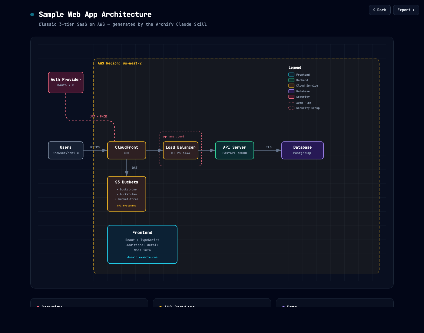
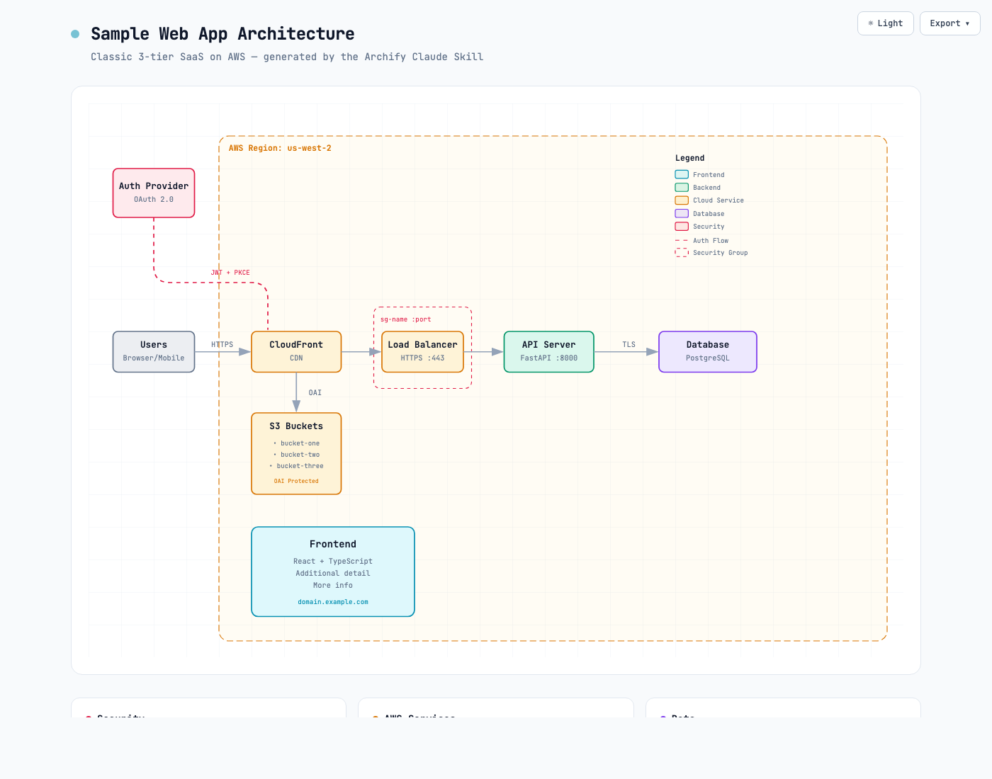
The export pipeline is where Archify separates itself. Every raster export renders natively at up to 4x the diagram’s intrinsic resolution. No upsampling blur. The browser rasterizes the SVG at full target size, so a diagram that looks sharp at 1x looks equally sharp on a 4K display or printed on a poster. The Copy PNG button puts the result straight on your clipboard for pasting into Slack or Notion.
The dual-theme SVG export solves a specific pain point I’ve hit multiple times: maintaining two versions of every diagram (one for dark README backgrounds, one for light). Archify’s SVG ships both CSS variable sets with a prefers-color-scheme media query. One file. Follows the reader’s preference automatically.
When to Use Which
Reach for Effective HTML when:
- You need general-purpose HTML artifacts (not just diagrams)
- You want plan documents or structured HTML pages
- You prefer SVG-first, full-screen layouts
- You want the lightest possible installation
Reach for Archify when:
- You’re specifically making technical diagrams
- You need dark/light theme switching
- You want clipboard copy and high-resolution export
- You’re producing diagrams for READMEs that need to follow system theme
- You need typed diagram outputs (workflow, sequence, data flow, lifecycle)
Both are free, both are MIT-licensed, and both validate the same thesis: HTML is the right output format for AI-generated visual artifacts. The skill layer just makes it repeatable.
This Isn’t a Claude-Only Pattern
The Effective HTML demo was generated by Fable 5. But the HTML diagram pattern works across frontier models. GPT 5.5 Thinker produces remarkably precise HTML rendering. Its spatial reasoning is strong enough that you can describe a system architecture and get back pixel-accurate SVG positioning on the first attempt, without a skill installed.
That’s actually the strongest validation of the thesis. When multiple frontier models from different providers all produce better diagrams in HTML than in Mermaid or any other format, it’s not a model-specific trick. It’s a format-level advantage.
The skill layer still matters even with GPT 5.5 Thinker or Fable 5, because it solves consistency across sessions. A powerful model produces great output once. A skill produces great output the same way every time. The difference is whether your Monday diagram and your Friday diagram look like they came from the same design system.
| Model | Raw HTML Quality | With Skill Installed |
|---|---|---|
| Claude Opus/Sonnet | Good, needs style guidance | Consistent, production-ready |
| Fable 5 | Excellent spatial layout | Excellent + consistent branding |
| GPT 5.5 Thinker | Precise rendering, strong spatial reasoning | Precise + repeatable style |
The takeaway: if you’re using any frontier model for technical diagrams, stop wrestling with Mermaid syntax. The HTML path is better regardless of which model you prefer.
The Bottom Line
The “HTML as AI output” pattern has graduated from clever hack to installable tooling. You don’t need to write elaborate prompts describing visual taste every time you want a diagram. Install a skill, describe what you want in plain English, and let the reference corpus handle the aesthetics.
One npx command replaces 200 words of styling instructions. That’s the kind of leverage that changes how often you reach for the tool.
Making architecture diagrams with AI? I’d love to hear what tools and workflows you’ve landed on. Reach out on LinkedIn.